1D Visualisation
Last updated: September 2026
The 1D graph widget lets you display a series of data points (a single value tracked over time — e.g. a questionnaire answer, a step count) as a line/point graph, both inside the graph editor for preview and as a message directly in the coaching chat.
Adding a graph to a screen
A graph is added to a screen like any other screen component, from the screen editor:
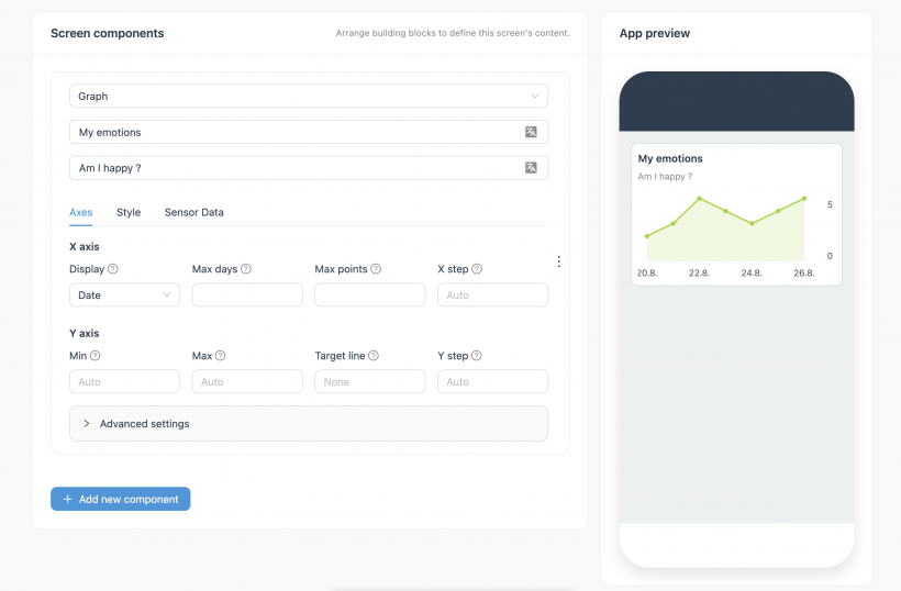
- Open (or create) a screen, click Add new component, and choose Graph from the component type dropdown.
- Give it a title (shown as the graph's heading, e.g. "My emotions") and a question/subtitle text (shown underneath the title, e.g. "Am I happy ?"). Both fields use the variable-mentions input — besides translation, they also accept variable mentions, so the text can be personalized (e.g. inserting the user's name).
- Configure the graph across three tabs — Axes, Style, Sensor Data — described in detail below. The App preview panel on the right updates live as settings change.
- The screen itself (separate from the graph component) has its own settings page, where you set:
- Unique identifier — either an auto-generated Default screen ID, or a Manual ID you type yourself (e.g.
screen-df3a222b). - An icon, shown in the menu or on buttons linking to this screen.
- A title, shown in the menu or on buttons (e.g. "Graph test") — this is the screen's own title, separate from the graph component's title set in step 2.
- Visibility conditions (optional, under "Screen visibility") — show the screen only when a selected variable matches.
- Unique identifier — either an auto-generated Default screen ID, or a Manual ID you type yourself (e.g.
- Once saved, the screen shows up in the left-hand navigation under App Screens → Screens, alongside the app's other screens.
X-axis parameters
| Parameter | Description |
|---|---|
| Display | What the X-axis represents / how it's labelled. Currently "Date". |
| Max days | Limits the graph to a recent time window, e.g. "last 20 days". Only applies when Display = Date. |
| Max points | The maximum number of data points to display at once (e.g. 5). If more data exists, only the most recent points up to this limit are shown. |
| X step | The graph always plots all available data points — this setting only controls how many of them get a date label underneath. For example, with X step = 3, only every 3rd point gets a date; the newest point always gets one. Left empty, the app picks a sensible spacing automatically (roughly 4 labels). |
If both Max days and Max points are set, whichever is stricter (limits the graph more) wins.
Y-axis parameters
| Parameter | Description |
|---|---|
| Min / Max | If left empty ("Auto"), the Y-axis scales automatically to the data. If set explicitly (e.g. min = 0, max = 12), the axis is fixed to that range and values outside it are cut off/clipped at the top or bottom of the chart. |
| Target line | Draws a horizontal reference line at a chosen value (e.g. set to 4 → a line is drawn across the chart at Y = 4). Useful for showing a goal or threshold. Defaults to "None". When Min/Max are on Auto, the target line's value is included when computing the automatic scale — so setting a target line above or below your data can stretch the Y-axis to include it. |
| Y step | Controls how many numbers are printed along the Y-axis, not how many gridlines. E.g. with a scale from 0 to 100 and Y step = 25, you'll see 0, 25, 50, 75, 100. A bigger Y step means fewer numbers shown, not more. Left empty, the app decides automatically. |
(See the Axes tab screenshot above for how these fields are laid out.)
Style parameters
Found under the Style tab of the graph component (next to Axes and Sensor Data — see the tab bar in the Axes screenshot above).
| Parameter | Description |
|---|---|
| Size | Overall size of the graph on screen: small, medium, or big. |
| Unit | A text label shown alongside the values (e.g. "points"). |
| Color | The line/fill color of the graph. |
| Dots | Toggles whether individual data points are rendered as dots on the line, or the line is shown without markers. |
| Show area | Toggles whether the area under the line is filled in. |
Defaults (if left unchanged): size = medium, Dots and Show area both enabled, color = the app theme's primary color.
Connecting real data: Sensor Data
Found under the Sensor Data tab of the graph component (next to Axes and Style).
The graph doesn't plot a normal CoachStudio Designer variable, because a variable only ever holds a single value. To plot a series of values over time, the graph reads from Sensor Data instead — a JSON object made up of timestamped entries, which behaves like an array rather than a single variable.
In the past, sensor data was populated via an API call; the current approach is to write it through a JavaScript snippet in the chat/dialogue builder.
Fields on the graph
| Field | Description |
|---|---|
| Identifier | Identifies the sensor data itself. |
| Type | Not heavily used yet, but reserved for future use. |
| JSON path | Points to the specific value inside the sensor data JSON object that the graph should plot. Uses dot notation starting with a leading dot, e.g. .questionnaire.happiness for the happiness value inside a questionnaire object that also contains sadness and accuracy. |
| JSON data identifier | A newer field: must match the identifier used by the snippet that writes the sensor data. The graph only reads this data, while the snippet writes it — so the underlying sensor data field must be marked both readable and writable. If it isn't writable, nothing can be written into it and the graph will stay empty. |
[Screenshot: sensor data configuration panel — identifier, type, JSON path, JSON data identifier]
Testing with random data
The graph editor has a "randomize" test action that generates new random values for the connected sensor data fields (e.g. happiness / sadness / accuracy) purely for preview purposes — this is test/debug data only, not real user data. Each run adds a new random data point, and switching the JSON path (e.g. from happiness to accuracy) plots that field instead. Running it repeatedly builds up a visible series of points on the chart, including the color/gradient styling configured above.
Advanced settings (component level)
The graph component has a collapsible Advanced settings panel — separate from the Axes/Style/Sensor Data tabs — containing two things:
- Visibility conditions — show or hide the whole graph component based on a selected variable (same mechanism as screen-level visibility conditions).
- Coach command — the exact
show-graphsnippet for this graph's current configuration, ready to paste into the coaching dialogue.
Showing the graph in chat: the "show-graph" command
Graphs can be shown directly as a message inside a coaching chat flow:
- Configure the graph (Axes, Style, Sensor Data) in the graph editor as described above.
- Open Advanced settings on the component and copy the Coach command.
- In the dialogue/chat builder, create a new message of type Command Message, and paste in the copied command.
The command has the form:
show-graph { …json… }For example (illustrative — field names should be double-checked against an actual copied snippet before relying on this for client documentation):
show-graph {"subType":"1d-linear","title":{"values":{"de_DE":"My emotions"}},"size":"small","color":"#9ad610","xaxisType":"date","showArea":"true","showDots":"true","dataBinding":{"type":"moodCheck","identifier":"demoQuestionnaire","jsonPath":".questionnaire.sadness"},"subtitle":{"values":{"de_DE":"Am I happy ?"}},"yaxisMin":null,"yaxisMax":null,"yaxisTarget":null}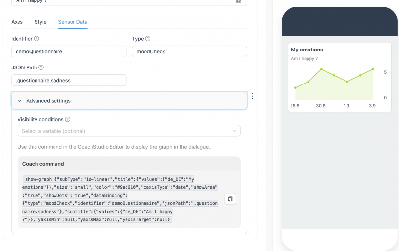
Prerequisite: write sensor data before showing the graph
The show-graph command only works with sensor data, not with regular variables, because a variable holds a single value while the graph needs several timestamped values. This means a message that writes sensor data (the JavaScript snippet described above) must run before the show-graph command in the same dialogue — otherwise there's nothing for the graph to plot.